Some Cosmic Tales of Smiljan Radić Told Inside the Belly of a Fish
June 2025

The boy
hidden in a fish, 1970
David Hockney
Etching and aquatint
231 x 268 mm
David Hockney
Etching and aquatint
231 x 268 mm
In an illustration for the Six Fairy Tales from
the Brothers Grimm, David Hockney’s delicate etched lines reveal a boy hiding
inside a giant fish at the bottom of a lake. The child, curled up in its belly,
resembles a foetus inside the soft shelter of a womb. The fish’s outline
becomes the thin boundary keeping the dark black waters from encroaching the
space inhabited by the boy.In an illustration for the Six Fairy Tales from
the Brothers Grimm, David Hockney’s delicate etched lines reveal a boy hiding
inside a giant fish at the bottom of a lake. The child, curled up in its belly,
resembles a foetus inside the soft shelter of a womb. The fish’s outline
becomes the thin boundary keeping the dark black waters from encroaching the
space inhabited by the boy.
The Chilean architect Smiljan Radić (1965 - ) cites this etching in his essay “Some Remains of My Heroes Found Scattered Across a Vacant Lot”. The writing adopts a stream of consciousness style where Radić wanders through a labyrinth of his heroes (artists, architects, writers) and various artefacts (photographs, models, illustrations, and fables) that have occupied a place in his mind – inviting us to glimpse inside his architecture cosmos.
The essay was initially delivered as a lecture in Santiago later published in a compilation of essays in his autobiographic book Every So Often a Talking Dog Appears. The book’s cover, in white, red, and orange, is punctuated by abstract motifs that resemble Vassily Kandinsky’s graphical translation of music. The unusual title is reminiscent of Miguel de Cervantes' satirical novella, The Dialogue of the Dogs, which uses a framework of two talking and reasoning canines to expose certain realities of society. In a similar vein, the “talking dog” in Radić’s book is simultaneously philosopher and guide, leading the reader into Radić’s cryptic cosmos sprinkled with magical realism, where prose and poetry, reality and fantasy are interwoven.
To dive deeper into his cosmos, let us cast our gaze back to “Some Remains of My Heroes Found Scattered Across a Vacant Lot”. In a prelude of the essay, he asserts:
Heroes have to exist; people need to feel a deep admiration for certain figures, or at least for their work. I think that is the only way to generate historical continuity, if we find some value in it.
One such hero is Aldo Rossi, whose name appears six times in the essay and whose book, A Scientific Autobiography, had a clear influence on Radić’s writing. Strong stylistic parallels can be drawn between the two. Resisting the standard linear structure, both texts operate in the realm of the nonrational, moved by impulses and fascinations. Rather than focusing on the architectural outcome, the two architects also address the personal and existential relationship they have with their work, which in turn forms the continuity of their architecture. In Vincent Scully’s words, the autobiographies are “changing but static, revolving around fixed points of obsession”.
In Radić’s essay, free associations, fleeting memories, and impressions fade in and out of focus, as if he is constantly distracted by multiple fascinations and possible linkages. The frequent use of low modality, such as “it seems”, “perhaps”, “may”, creates a tone of uncertainty, allowing him to construct a cosmos that does not pretend to be self-explanatory, reasonable, or logical. In fact, Radić states that he attempts to generate in his writing “an enchantment through a weak certainty,” leaving “the truly real and the really true” to theorists and specialists. Undoubtedly, Radić was influenced by Rossi’s writing, who recognised that a certain limited and honest disorder might most authentically reflect the fluid and sometimes inconsistent mind of an architect.
There is a lightness in the way Radić writes. Pivoting phrases such as “There is a connection between…”, “It is in these terms that…”, and “If we return to…” help Radić leap from one fascination to another and back, and the text does not burden itself with deductive reasoning or the need to reach a predetermined destination. Something briefly mentioned in the previous paragraph, such as “a thin tent”, becomes the subject of the next. The memory of “the tent of a family circus” inspires surreal imageries of “a false ceiling”, “an impoverished sky”, and a “thin wall of plastic fabric [that] separates the trapped made-up air inside from reality outside.” Radić continues to layer metaphors upon metaphors, illustrating an architecture that constitutes the thin membrane between internal fiction (the show and its spectators) and external fact (the empty football field on which the tent stands). Like the silhouette of the fish, the tent architecture upholds the suspension of disbelief – of promises of possible, yet unforeseen ways of life.
One could look similarly at the fisheye lens used to photograph Constant Nieuwenhuys (another one of Radić’s heroes) in his studio. Radić starts by describing Constant seated amongst a curated arrangement of his models in a third person passive voice. In the same paragraph, the writing shifts without warning to first person perspective, “all of a sudden, we are inside his head, looking out or at ourselves through the transparent, curved tissue of his retina or his space devourers (spatiovores).” Perhaps for Radić, the fish-eye camera lens resembles in some way the architecture that upholds the fiction of Constant’s curated studio, distorting and suspending reality, swapping the observer with the observed. Radić’s internal monologue four pages later, “Once we leave there, or they kick us out, in the blink of an eye everything will exist again,” underscores his fascination with the construction of such “a momentary conviction”.
Throughout the essay, fiction is always associated with the intangible. It is the winter winds that blow in the corridors of the selfish giant’s castle, of Rossi’s fog which penetrates the interior of the Basilica of Sant’Andrea in Mantua, and of wandering “almas (souls)” silently inflating the family circus tent. The castle, the basilica, and the tent are all forms of shelter that separates interior from exterior, and the fiction from reality. However, one cannot exist without the other. Radić proclaims the circus as fiction, and fiction as “a made-up face of reality”. So, if we take shelter as a generator for fiction, then it must also be essential to our understanding of reality.
At the same time, the shelter should adapt to the protagonist of the fairytale. According to Radić, “the fate of all shelters, or of any studio, is tied to its inhabitant.” The fish that hides the boy, the study of St. Jerome, and the amorphous mesh model housing Frederick Kiesler to dare protective refuges for their respective inhabitants, sharing their scale, proportions, and time.
Radić’s Serpentine Pavilion in 2014 was conceived with the scale of the human inhabitant and the hands of a giant in mind. Its enigmatic presence emerges as a result of layered sources of influence. On one hand, the torus form resembles ancient carved Indian stones; on the other, the folly is the scaled-up papier-mâché model of The Castle of the Selfish Giant (2010) inspired by Oscar Wilde’s tale with the same name. The voluptuous space also bears a visual connection with Kiesler’s elevated Endless House, which was conceived as “a spatial shelter to be filled with the exuberance of the life that we have yet to invent.” The translucent fibreglass blob balancing on six quarried boulders recalls the Hockney’s etching of the see-through fish, floating silently above river rocks with a child in its belly. Through a dissonant juxtaposition of rough and refined, archaic and futuristic, permanent and fragile, the building refuses to offer a singular interpretation or take part in a singular history.
Openings formed by Burda patterns at the model scale become sharp cutouts at the pavilion scale. Through these cracks and openings, nature rushes inside while the fictive guts of the shell spill out. These can be traced back to Radić’s interest in Rossi’s idea of the ‘sventrata’ (gutted) view, through which we can peer into architectures’ hidden interiors.
To a certain extent, “Some Remains of My Heroes Found Scattered Across a Vacant Lot” functions in the same way, carving out a hole in the fourth wall, Gordon Matta-Clark-style (another hero), and offering us a glimpse into Radić’s multi-dimensional universe. Through an open-ended rhizomatic approach (as mentioned by Deleuze and Guattari in A Thousand Plateaus), the essay puts Radić’s work in dialogue with heroic figures and artefacts, anchoring Radić’s work in the fleeting continuum of history. Perhaps it is by no coincidence that Radić’s book Every So Often a Talking Dog Appears adopts a strikingly similar cover design to A Thousand Plateau’s red and white. To use Kersten Geers’ words, “Since the past, sources have never been linear; on the contrary, there have always been multiple simultaneous influences.” Indeed, Radić’s essay affirms an architectural attitude that eagerly builds alliances with artistic, cultural, and literary reference points.
Perhaps the best way to understand Smiljan Radić’s work is to see it as a momentary constellation of his collection of heroes, memories, and artefacts. His architecture exists at the nebulous boundary between fiction and reality. Every new project gives birth to a new star, generating new possibilities within a cosmos that is unstable, luminous and infinite.

The boy hidden in an egg
David
Hockney
Etching, aquatint and drypoint
198 x 170 mm
Paying Attention in the Metro:
Analysing Perception and Information Load in Urban Transit Environments
January 2025
As the traveller descends into the metro station on one of the constantly appearing and disappearing escalator steps, they enter a bustling bazaar, where advertisements, signages, shop fronts, digital display screens and even handrails compete for the scarce resource – attention. Efficient navigation through the labyrinth of stairs, corridors and platforms becomes a daily duty of the commuter. The problem arises, however, when an abundance of competing stimuli erodes the visual hierarchy of metro signages, resulting in confusion, reduced efficiency, and inducing psychological stress on the traveller.
The typology of the metro station is selected for the analysis of attention dynamics as it is a unique urban environment where humans are passively exposed to a vast amount of information during their journey. As its surfaces are increasingly saturated with readily available information, the metro station becomes a microcosm of the contemporary metropolis. The essay refers to metro stations in cities across the world such as Shanghai, Milan, Vienna to exemplify information excess and attention deficit as global phenomena.
However, this information is not free to attain. The traveller must invest a fraction of their finite pool of mental resources to process and access it. Indeed, in an information-rich world, “attention is the commodity in short supply” (Lanham, 2006, p. xi). Thus, the key economy at play today is no longer an economy of money or material, but rather, one of attention. It is thus important to dissect and analyse the complex, high-stimulus environment of the metro station as well as the way the traveller perceives such information.
The Ecological Approach to Visual Perception (Classic Edition) by James J. Gibson (2014), first published in 1979, provides a powerful lens to do so. Gibson defines “perception” as being “aware of the surfaces of the environment and of oneself in it” (2014, p. 244). It is a process which occurs between the moving animal and its partly dynamic, partly invariant environment (Gibson, 2014, pp. 4, 10). Adopting this theoretical framework, the essay addresses perception through the eyes of the urban traveller, the animal, within the metro station, its environment.
Diverse visual stimuli in metro stations are strategically designed to demand and consume the attention of the urban traveller through the lure of colour, illumination, and movement. These techniques not only attempt to inform but also to influence behaviours of travellers, contributing to the broader dynamics of attention economics in public spaces. By analysing metro stations as markets where attention-information transactions take place, the essay reflects upon the tension between human’s limited attention capacity and increasing information load in urban spaces.
An Economy of Attention
The analysis further builds on the capacity theory outlined by Daniel Kahneman in Attention and Effort. Kahneman writes that “the total amount of attention which can be deployed at any time is limited” (Kahneman, 1973, p. 9). In the supply-demand graph shown in Figure 1, Kahneman also draws a close linkage between attention and effort, suggesting that the total supplied effort is composed of the capacity supplied to a primary task and spare capacity. Thus, the adequate allocation of this expendable resource becomes of utmost significance in an attention economy.
Figure 1.
Supply of effort as a function of demands of a primary task

Note. Source: (Kahneman, 1973, p. 15).
The term attention originates from the Latin word attencio, and is defined as “the action, fact, or state of attending or giving heed; esp. in to pay or give attention” (Oxford English Dictionary, 2024). The English expression “to pay attention” implies that attention functions as a form of currency – one that is deeply linked to the giver of attention and arguably more valuable than money.
In an attention economy, individuals expend attention in exchange for information, “which is in turn monetised via advertisement” (Franck, 2019, p. 8). Some of the information is actively sought out, some passively registered, which Kahneman identifies as applications of voluntary attention and involuntary attention (1973, p. 42). For example, to understand one’s position in the network of metro lines, the traveller must pay attention to the sign. To learn of the extraordinary lifestyle promised by new commodities, the traveller must give their attention to the advertisement. The metro station thus becomes a marketplace where attention/effort transactions are constantly processed, where forces are constantly in tension between the practical and the promotional, the public and the private.
Metro Stations as Supermarkets
The underground metro station is usually severed from the outside world to enable the curation of a completely controlled environment. This world operates on its own functional logic to not only guide the metro user efficiently through its spaces, but also display advertisement products along their journey to vie for their scarce attention capital. In an economy where attention is traded for information rather than money for goods, metro stations have emerged as the modern-day supermarkets of the attention economy.
Figure 2.
East Nanjing Road station line 2 platform

Note. Source: (Izudiver, 2014).
In the same way that products on shopping aisles are designed to encourage the shopper to spend money in exchange for the commodity, advertisements along tunnel walls aim to encourage the traveller to dispense attention and effort in exchange for the information they portray. In supermarkets, the items placed at eye level, between 1.2 and 1.5 metres above the ground surface, is expected to attract 14-15% more attention than top and bottom shelves (Ming, Burke, Hui, & Leykin, 2021, p. 1137). Similarly, on the metro platform, large screens and posters vertically centred at eye level fill the traveller’s visual field with stimuli. In Shanghai, more than 15,000 advertising panels from advertising display company STDecaux permeate 503 metro stations (JCDecaux, 2021). At East Nanjing Road Station (Figure 2), the functional information about metro direction is positioned on a brightly lit strip above the platform to enable visibility from a distance and in crowded situations. In contrast, advertisements in lightboxes assume prime attention real estate: positioned at eye-height and set against the dark background of the tunnel wall. The traveller can even walk along the linear platform to leisurely browse the aisle of evenly spaced eye-candy. This information imposes itself on the waiting traveller, capitalising on a few minutes of their idle attention before the next metro arrives.
In comparison, Milan’s Repubblica station (Figure 3) places functional signage on the same plane as its advertising. The station’s name and large marketing posters are alternatingly arrayed along the dark tunnel at eyelevel. Positioning both types of information side by side undermines the hierarchy of importance to the observer as well as blurs the distinction between the private and public. It is impossible to only perceive the yellow sign and ignore the adjacent panels in the peripheral vision. In both examples, visual information is purposefully placed where the resting gaze naturally lands, and in this fraction of a second, as the brain starts deciphering what the eyes see, attention-information transactions have already begun taking place.
Figure 3.
Repubblica Metro Station in Milan

Note. Source: (Ordóñez, 2011).
Lighting also plays a significant role in the perception of surfaces and allocation of attention in metro stations. Distinct from urban spaces above ground where the sun provides variation in lighting intensity and angle, metro stations are usually completely devoid of sunlight, illuminated instead by invariant artificial lights throughout the day. Like large supermarkets, the lack of windows and skylights in metro stations suspend the individual’s sense of time and keep them captive for longer, thereby increasing their total attention expenditure. The elimination of a variable lighting factor also ensures that signage and advertising panels, like products on a shelf, are always perfectly illuminated for the observer’s eye. However, the information-loaded environment becomes visually confusing and psychologically stressful for the commuter when important wayfinding signs are overshadowed by more illuminated, or even light-emitting advertising surfaces. They need to spend more effort and time to discern the sign from the clutter of every other visual stimulus. For example, in Shanghai’s East Nanjing Road station (Figure 2), the backlit advertisement lightboxes threaten to take precedence over the illuminated navigation strip in its degree of brightness.
Advertisement as the New Ornament
Not unlike the walls of the contemporary metropolis, surfaces of metro stations today have been “invaded” by images of headphones, SIM cards, face masks, coffee and so on, which are essentially commodities (Coccia, 2018, p. 11). These images of attention marketing from private companies are increasingly encroaching into the public realms of the metro, transforming commuters into consumers. The Milano Red Line is an example of this. The advertising campaigns, previously allocated within specific frames coherent with the design of the station (B. Carnevali, personal communication, October 29, 2024), are expanding their claim on public surfaces: metro gates, inside and outside vehicles, metro windows, platform walls and tunnel walls. Every surface visible to the urban traveller can be transformed into a point of sales to attract and monetise attention.
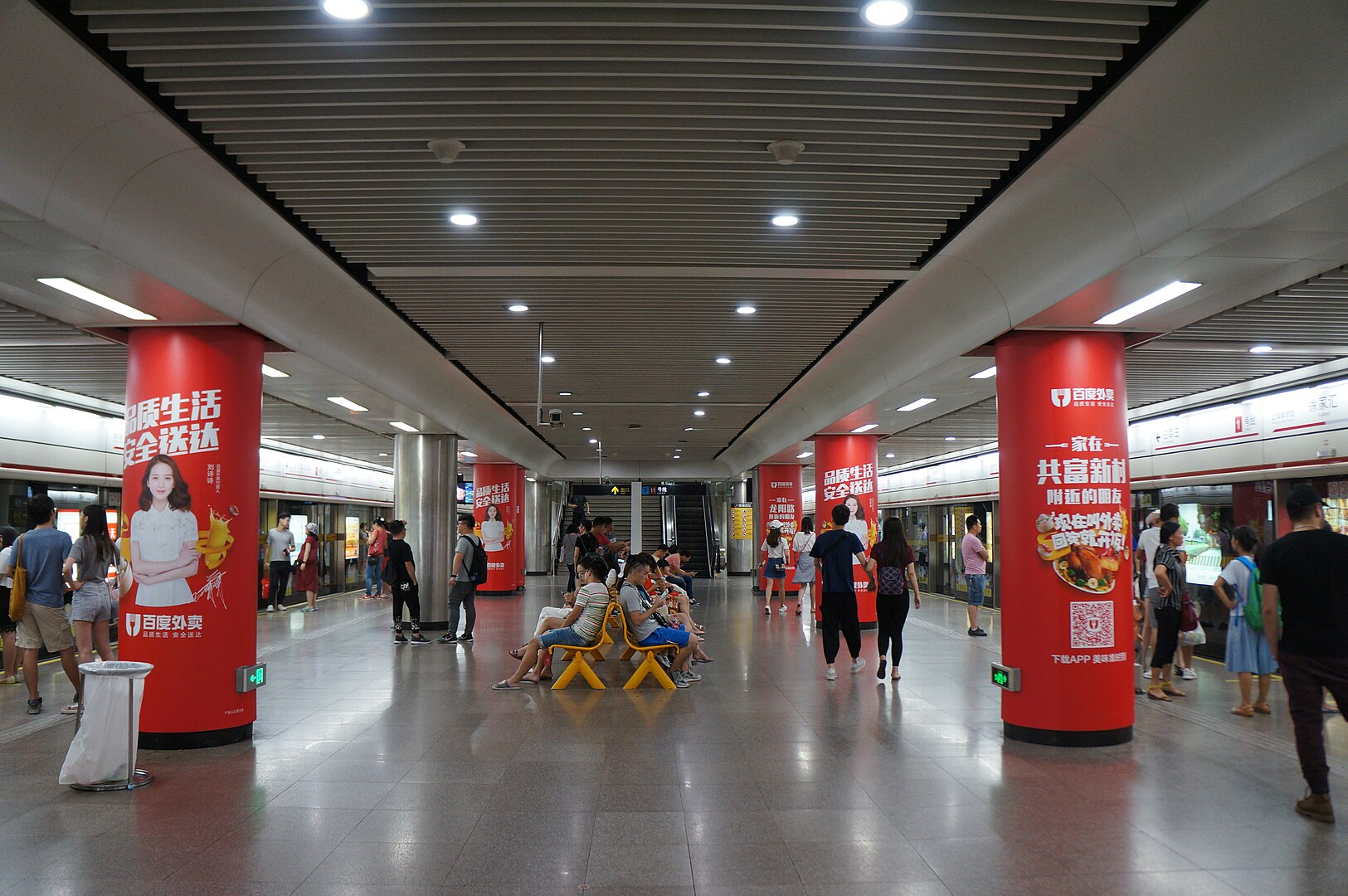
Figure 4.
Platform for L1 of Xujiahui Station, Shanghai
Note. Source: (MNXANL, 2016).
To understand how images are perceived, it is important to first understand the picture as a “treated surface” (Gibson, 2014, p. 269). The picture’s colour and texture do not coherently reflect its composition as do the colour and texture of a non-pictorial substance (Gibson, 2014, p. 26). Instead of solely showing information about the surface itself, a picture also depicts its scene - the virtual surfaces in the picture. This duality of invariant information requires the viewer to apprehend the picture both directly and indirectly (Gibson, 2014, pp. 269-270). For example, the decorated columns in Xujiahui Station (Figure 4) are simultaneously perceived by the commuter as its substance – a printed poster wrapped around cylindrical columns - and its pictorial depiction – a life-sized woman smiling in front of a red background and surrounded by slogans. This ambiguity in meaning implies that more effort and attention capital are required to make sense of and discern the two apprehensions. The allegory is evident: society today is no longer supported by columns of stone, concrete, or steel, but is instead built upon columns of symbolic depictions of commodity.
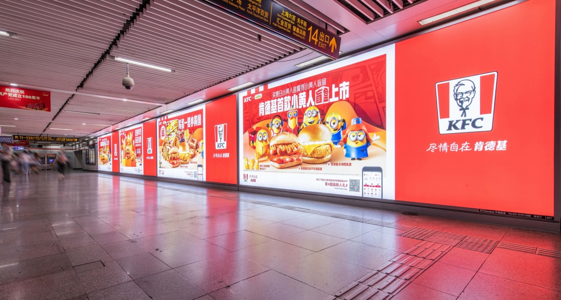
Figure 5.
KFC Lightbox Advertisement in Xujiahui Station, Shanghai
Note. Source: (JCDecaux, 2021).
Moreover, it is not a coincidence that the red columns echo the red colour-coding of Line 1. Advertisement here takes on a functional role too. The colour coordination (which will be further discussed in the next section) is also visible in the passageway of Xujiahui Station (Figure 5), where over-sized KFC advertisement covers an entire wall in red. Strategically employing the same colour, these panels have replaced the red orienting stripe that usually guides movement. In addition, these large lightboxes emit so much light that they are eclipsing and even overtaking standard ceiling lamps as interior illumination. The ambiguity of roles further reinforces the idea that the private and the public are becoming increasingly entangled and difficult to distinguish in metro environments. The dual-function advertising panels undoubtedly optimise the use of space, but they do so to the detriment of the human psyche. Rather than adorning city walls with intricate Baroque reliefs or exposing their raw materiality in Brutalist fashion, contemporary urban environments are increasingly defined by advertising as their main surface treatment.
Persisting Visual Cues as Navigation Anchors
Despite the overwhelming information-rich surfaces in metro environments, invariant visual cues such as colour-coding and clear signage provide clarity and direction during navigation. Surfaces that visually persist as the individual moves around in space function as a positional anchor for the urban traveller. According to Gibson, since “all observers are animals and all animals are mobile,” observation naturally implies motion, while stationary observation is a special case of it (2014, p. 66). As an animal in locomotion perceives its environment, its point of view changes. However, parts of its environment, a rock for example, stays unchanged and is perceived by the moving animal as so. These surfaces in the environment which persist during perception are referred to by Gibson as invariant structure (2014, p. 66). Invariant structure plays a key role in reducing the observer’s cognitive load as they require less mental effort to discern. The perceptions of a stationary rock during movement reveals its previously hidden surfaces to complete the picture instead of interpreting the object anew from every new position.
Figure 6.![]()
Signage in San Babila Station, Milan

Signage in San Babila Station, Milan
Figure 7.![]()
Handrail in San Babila Station, Milan
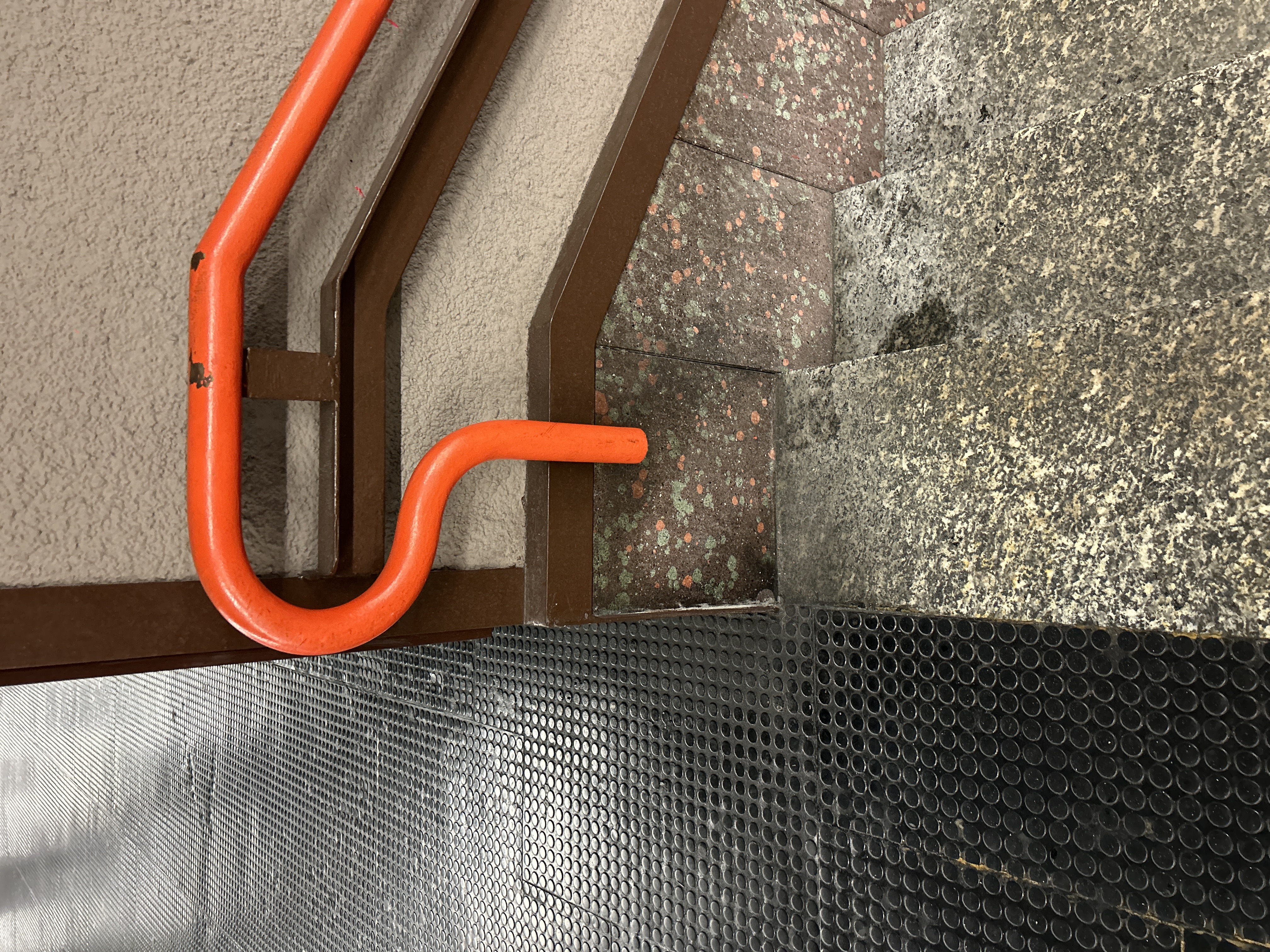
Handrail in San Babila Station, Milan
Figure 8.![]()
Lighting Strips in Karlsplatz Station, Vienna
Lighting Strips in Karlsplatz Station, Vienna
Note. Source: (Photographs taken by author).
The orientation system of Milan’s M1 metro line is a clear example where consistent colour use and sign placement helps relieve travellers of cognitive load and stress. The distinct warm red colour for Line 1 has a pervading presence in the underground environment: in the design of signs, handrails, rubbish bins, metro carriage exteriors and interiors. The vivid shade of pure red, often associated with energy, blood, and circulation (B. Carnevali, personal communication, October 29, 2024), captures the observer’s attention as it contrasts starkly against the black Pirelli rubber floor and the speckled brown wall panels. Matte red bands carrying wayfinding information runs along the top of metro walls (Figure 6). As the traveller walks from the metro foyer down to the platform, the horizontal band acts as a visual anchor, stabilising the traveller as they perceive their own descending motion with respect to the band. Glossy red handrails at waist-height (Figure 7) further highlight their affordance for tactile support when traversing the levels of the station. Although the strong red colour demands attention from the traveller, it is used functionally to foreground vital wayfinding information and minimise effort spent in searching. To the daily commuter, who possess a perceptual readiness towards the consistently coloured signage in stations, wayfinding “demands less information input, and less attention” (Kahneman, 1973, p. 193).
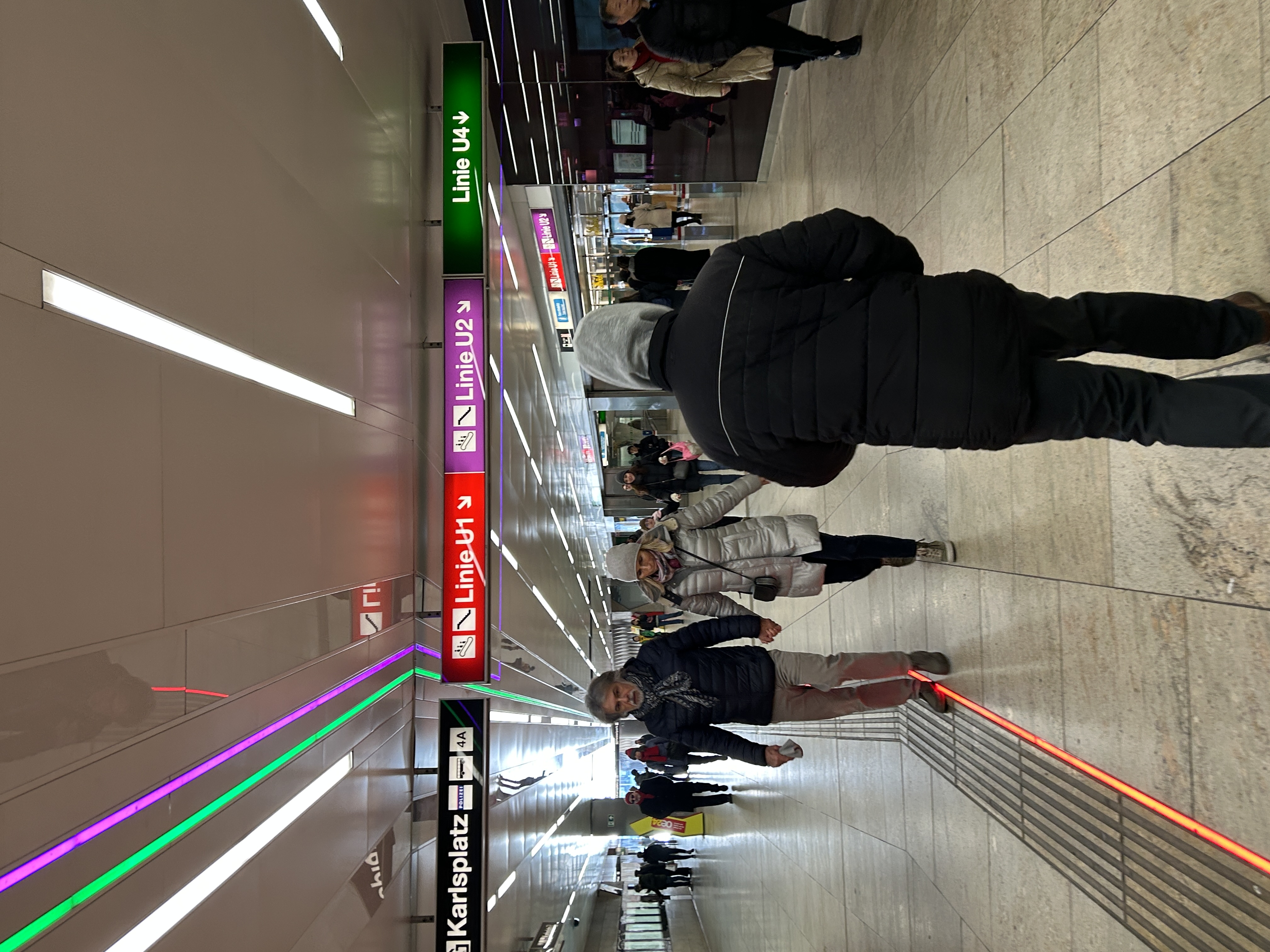
Light-emitting strips in Vienna’s Karlsplatz station (Figure 8) are in comparison less successful. Resembling emergency exit paths on the airplane, the red, purple, and green strips lead the way both below and above the traveller to their respective entrances. While they cater to the visually impaired commuters, the strips are too thin to make a substantial impact on visual perception, especially in a crowded station. As a result, they contribute to the overall visual noise and erode the attention capacity of the traveller without effectively conveying meaningful information. Therefore, when used consistently, colour coordination across various surfaces allows them to be passively perceived as coherent and invariant parts of the overall environment rather than salient features demanding focused attention.
Motion and Attention – on Escalators and Carriages
While invariant structures reduce the traveller’s cognitive load, variant structures provide dynamic information that captures our attention. Insofar as spontaneous looking is determined by the “novelty, complexity, and incongruity of stimuli”, humans naturally tend to focus their gaze on “moving objects” (Kahneman, 1973, p. 65). The significance of motion in capturing attention in exchange for information are thus analysed for metro escalators and moving carriages.
Their path predetermined, their locomotion externally facilitated, the escalator passengers’ attention capital is freed up. Referring to Kahneman’s Capacity graph (Figure 1), when the attention demands of the primary task is low, such as when the commuter is so familiar with their daily route that they expend very little effort in figuring out where they need to go, or when one steps onto the escalator, a greater proportion of the overall capacity becomes expendable spare attention. Conveniently, the escalator provides another opportunity for advertisers to attract this surplus attention.
Figure 9.![]()
Escalator Advertisement in Keleti Pályaudvar Station, Budapest
Escalator Advertisement in Keleti Pályaudvar Station, Budapest
Figure 10.![]()
Escalator in Victoria Cross Station, Sydney
Escalator in Victoria Cross Station, Sydney
Note. Source: (Photographs taken by author).
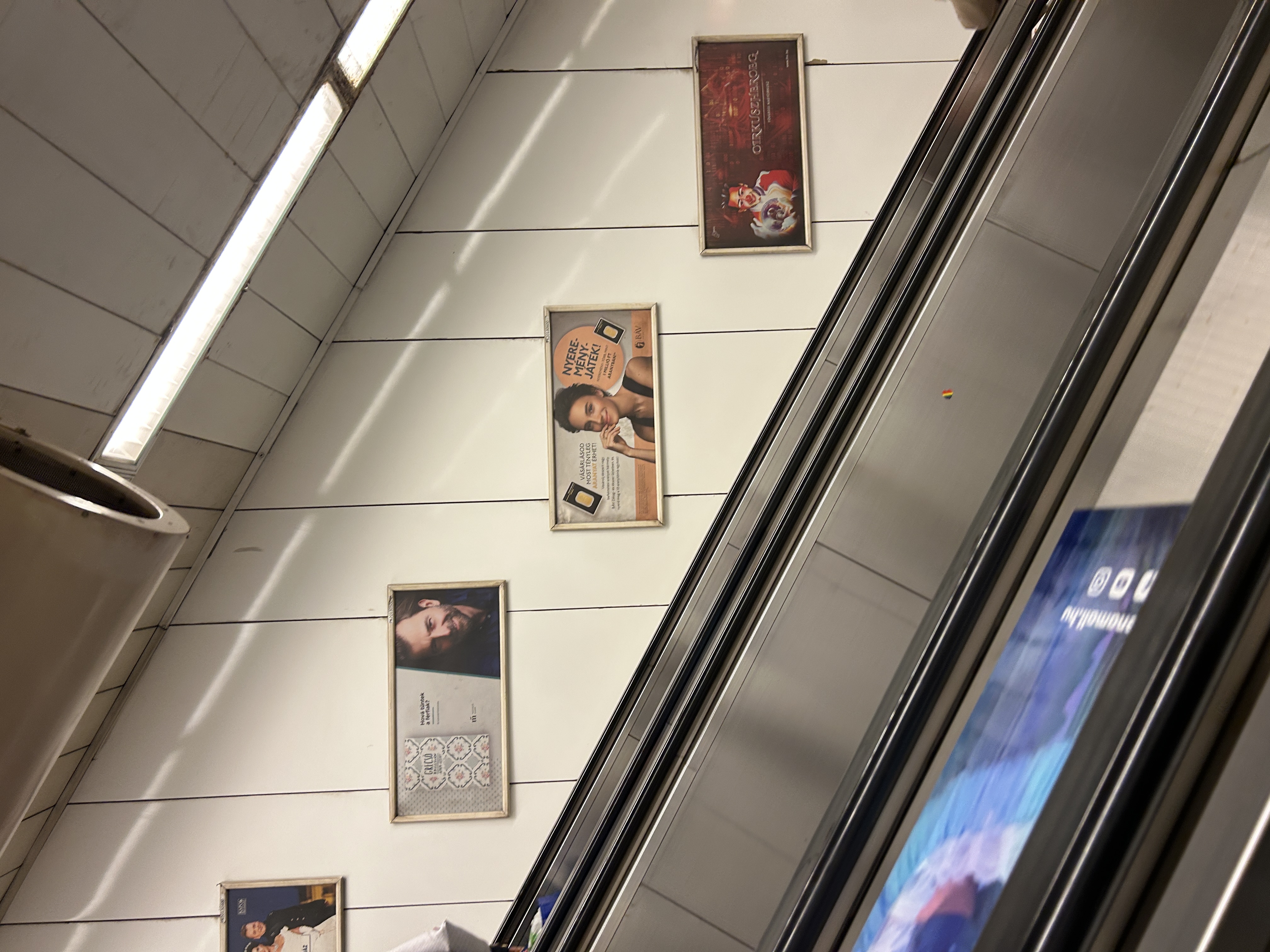
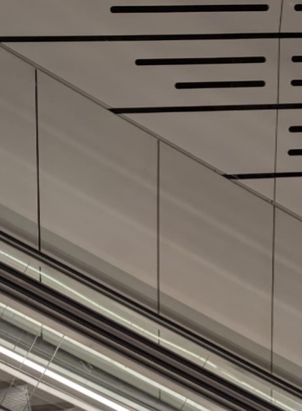
In Budapest’s Keleti Pályaudvar Station (Figure 9) posters adorn both the vertical surface of the wall and the diagonal surface between escalators. It is impossible to avoid looking at advertisement. The escalator carries the rider through the gallery of posters at a steady, controlled speed, showcasing each advertisement as a work of art in their own right. As the rider perceives their facilitated locomotion relative to the persisting wall surfaces, the stationary wall advertisements appear to be in motion. As a result, each novel panel spontaneously captures the idle gaze and demands “a greater effort of processing than do more familiar stimuli” (Kahneman, 1973, p. 4). Contrastingly, Sydney’s Victoria Cross Station walls (Figure 10) are completely bare of any pictorial information. There are no framed stimuli that excite and seduce the brain into expending its spare attention capacity. The white wall panels are perceived as familiar, persisting surfaces which afford cognitive repose.
Figure 11.
Digital Escalator Advertisement in Karlsplatz Station, Vienna


Note. Source: (Photographs taken by author).
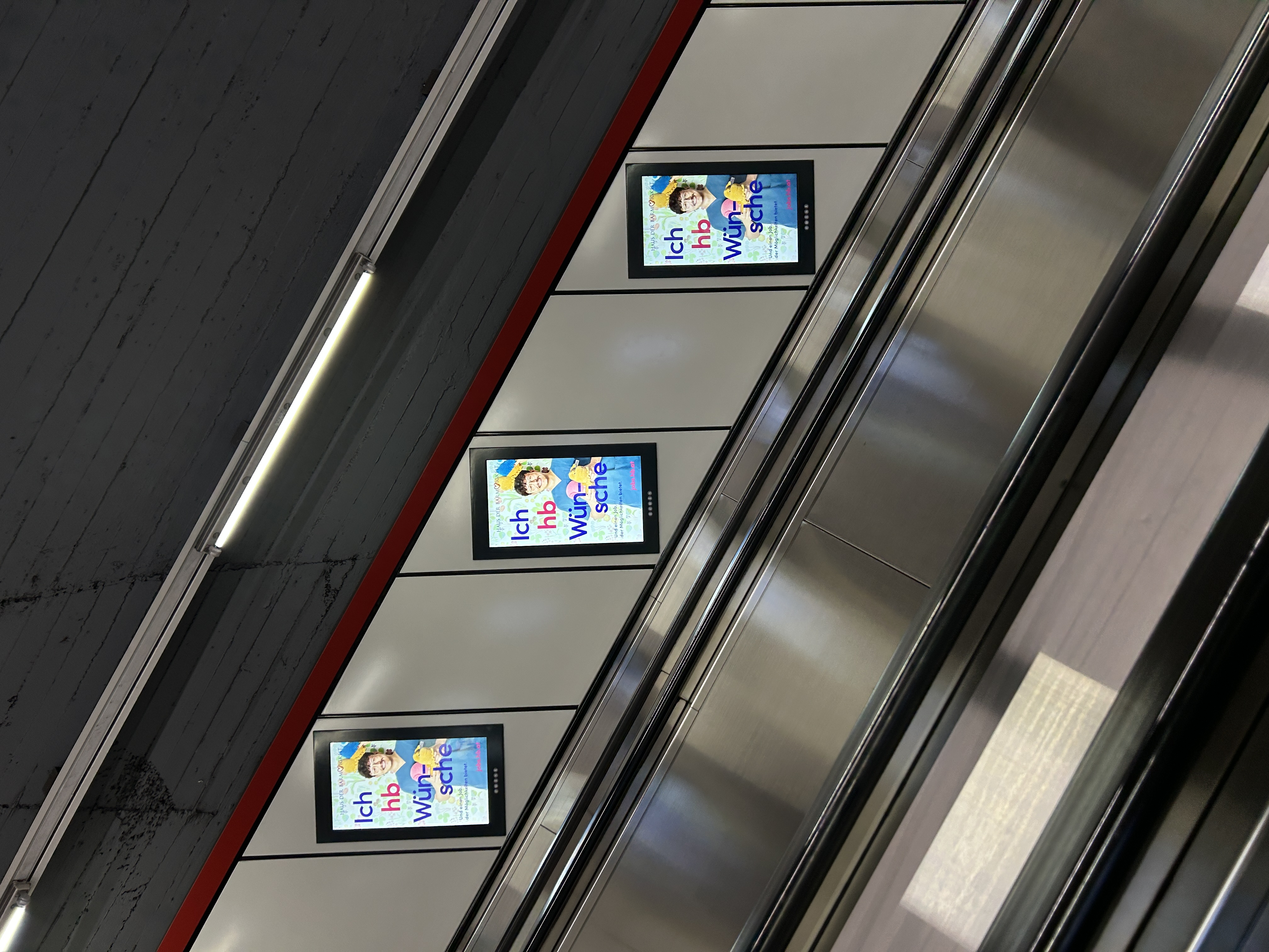
Digital screens arrayed along the escalator corridor in Karlsplatz Station (Figure 11.) employ another display strategy. All the screens are synchronised and show animated ads that change every 10 seconds. During the 30-second-long journey, the passenger is entertained by at least three advertisements. The transition from one advertisement to another on all screens causes a sudden and dramatic change in the perceived environment, which forces the eye instinctively to look and focus and discern.
Figure 12.
Digital Tunnel Advertisement in Beijing

Note. Source: (Kefland, 2011).
The moving carriage is another scenario where motion is used innovatively to encourage attention spending. In Beijing, sequences of static LED panels were installed inside the tunnel between two stations (Figure 12). Using the principle of zoetrope animation, the movement of the metro across these displays created the illusion of motion, making them appear as a continuous video. The system exploits the temporal and spatial void between stations as well as the spare attention capacity of bored commuters.
Figure 13.
Projected Tunnel Advertisement in Yunnan

Note. Source: (无花果, 2024).
The MTPS system in Yunnan on the other hand, projects high-definition videos on the tunnel walls (Figure 13) while the metro is in motion to attract user attention. The uneven surface of the tunnel, made visible by the bright emitted light, creates fleeting silhouettes and perceptible disturbances in the imagery. The commuters are stationary, but their local environment—the carriage—is in motion. The projected visuals are in sync with the carriage, and is therefore perceived, relative to the viewer, as stationary. Only the surface of the tunnel as well as the projected video is moving – blurred. The window of the metro carriage, which previously depicted a black, blurred void that the commuter perceives with minimal effort, is reminiscent of the panoramic window of the Bernina Express, revealing dynamic sceneries through synthetic Alps of advertisement.
In the high-stimulus environment of metro stations, attention has become an invaluable currency, exchanged for navigation, entertainment, and persuasion. In this curated supermarket-like urban environment, the traveller is no longer merely a commuter, but also a consumer. The application of theoretical frameworks—Gibson’s ecological approach to perception and Kahneman’s capacity theory of attention—assists in elucidating the complex yet nuanced psychological interplay between travellers and their urban environment.
Moreover, metro stations, as microcosms of modern cities, reveal the increasingly blurred boundary between private and public domains as well as the dependence of society on commodities. Competing for the limited attention of the traveller serves as the common objective of both public signage and private advertisement. While invariant surfaces provide some cognitive relief to the traveller, other strategies employed to attract attention—colour, illumination, motion, and strategic placement—often result in visual disorder, undermining the visibility and clarity of wayfinding systems and increasing psychological stress.
The analysis of metro stations sheds light on the global phenomenon of information proliferation and attention poverty, where information-loaded surfaces have become the desired ornamentation of urban environments. The abundance of stimuli is not merely an imposition upon the metro traveller but also an actively sought-after aspect of the daily commute that keeps the individual entertained. This dynamic creates a self-perpetuating cycle, revealing human’s inherent willingness and perhaps even desire to pay attention.
Pittwater Summer School
Learning from Richard Leplastrier, Peter Stutchbury,
Craig Burton, Karen Lambert, and the land
Craig Burton, Karen Lambert, and the land
25th February 2023
Sydney, Australia
Sydney, Australia
 The Arrival (Wendy, Frank, Georgia, Nick)
The Journey There
Taking the ferry from Church point, we sketched gentle green hills, proud sandstone headlands, and glistening blue waters, before finally arriving at Pittwater.
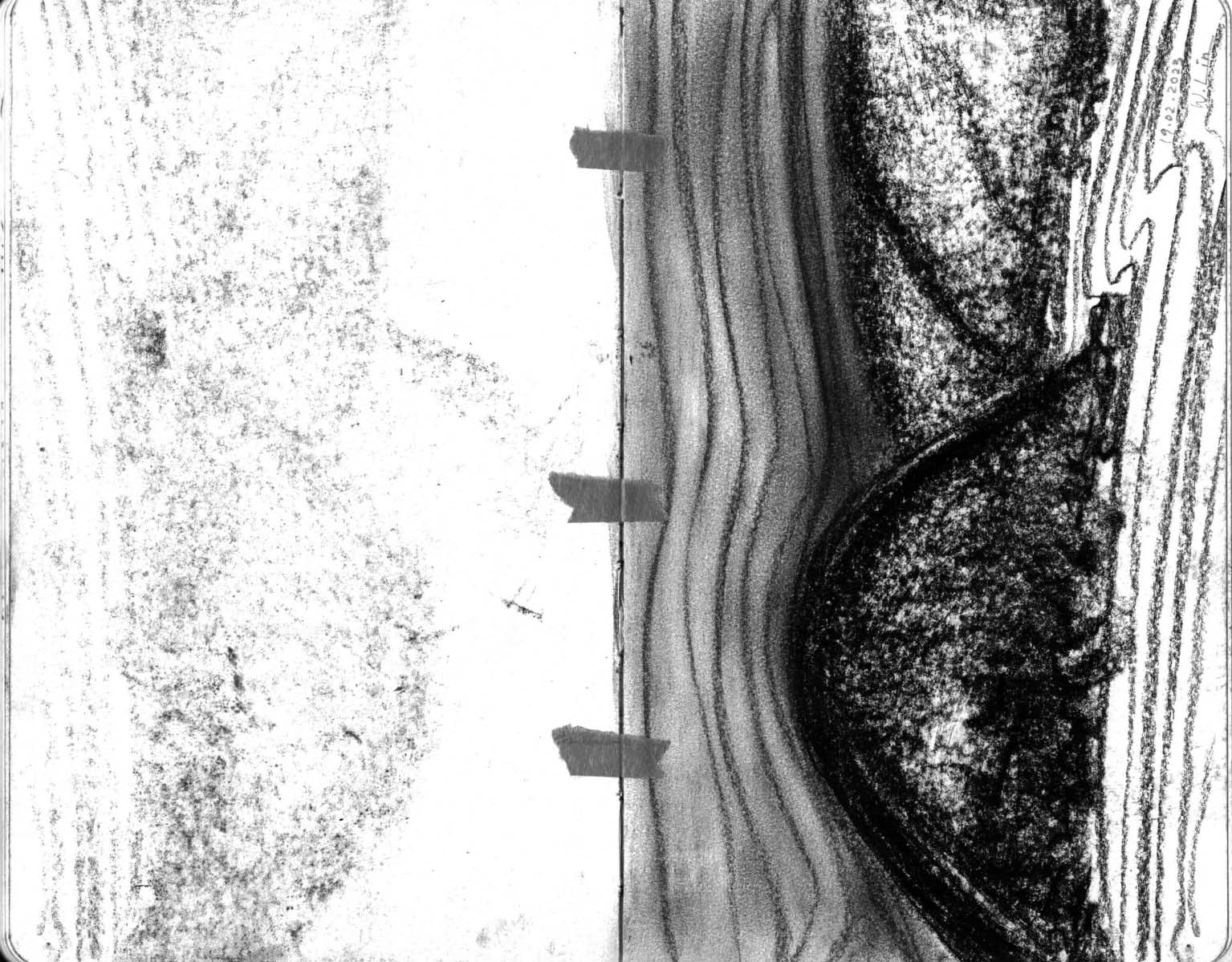
Rick gave us pieces of charcoal to sketch the undulating landscape - it drew like butter across the page. The black powder sitting on the page came loose, making ghostly imprints on the other side.
Rocking on the surface of the water, Peter pointed out that we were sitting on a platform in a large room - with hills as walls, the ocean as floor, the sky as ceiling, and the ferry as the platform.
After 6 months of being landlocked in Switzerland, I really missed the smell of the ocean.
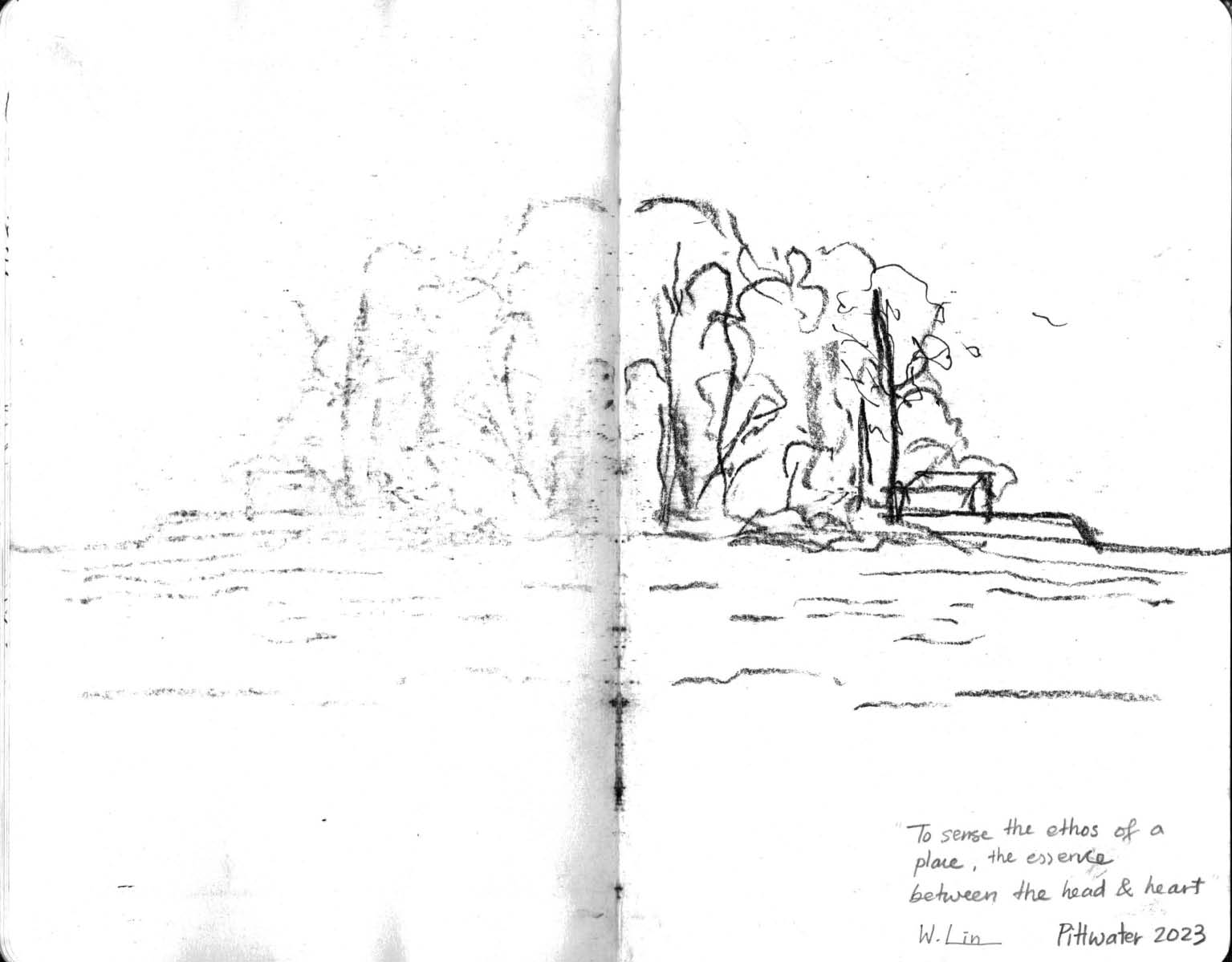
On Drawing
Drawing as an act of OBSERVING, and of SEEING.
To OBSERVE is to recognise the relationship between light and dark. For example, my old painting teacher, Paul, would always emphasise that a drawn line denotes a stark transition between light and dark. As we stood in the broken light filtered through broken eucalyptus leaves, listening to the deafening chiming of summer cicadas, Rick taught us a little trick, which he himself learnt from his old art teacher Lloyd Rees. “Soften the eye’s focus and look through almost closed eyelids,” he said, “then one would be able to discern the light from the dark without being drawn to all the details.”
To SEE is to look beneath the surface, and to really understand the essence of what is visible. When we sailed past Barrenjoey Head on the ferry, Rick pointed out to me the horizontality of its sandstone layers. Indeed, this is how sandstones are created, layer upon layer. Upon erosion, the layers are revealed.
Drawing allows one to better understand something, this understanding allows one to distil something down to the essence, and liberates one to abstract, omit, and play with its representation.
On Sandstone
These sandstone layers, which are hundreds of meter deep, are deposited here by water over millions of years. It was interesting to learn that Sydney Basin consists of three main sandstone layers: Wianamatta (Bringelly Shale, Minchinbury Sandstone, Ashfield Shale), Hawkesbury, and Narrabeen as the deepest layer.
On Generosity
Being generous is a habit.


